HIVEQUEST
client project : feature design www.hivequest.co
HiveQuest is an online platform that provides group challenges to help people develop the key mindsets and skills for living a successful and meaningful life.
Project Goal
HiveQuest is aware that their community and engagement experience isn’t meeting their desired goal, which is causing users to drop off ⅔ of the way through the challenge. How might we improve the community and engagement experience so that HiveQuest is more successful in its goal.
2 UX designers
1 Product manager
1 Developer
Solution
To build a profile dashboard that focuses on three main components: Community, engagement and completion rate. The profile dashboard is designed to create a sense of belonging to the user, while also motivating them to engage with other participants and guide them to complete their challenge.
Process
User Research
Main Insights from User Research:
When users can customize their profiles, it can enhance their sense of community.
By having progress bars, users can stay on track and manage their own engagement level.
Rewards/incentives can inspire and motivate users to complete challenges.
These insights allowed us to start assessing what keeps users engaged, what motivates them to complete the challenge, as well as what inspires them to return and also participate in challenges.
PERSONA
Creating personas helps us create a clear picture of the user's expectations and how they relate to the problem, as well as how they might react to the solution. Our personas describe real people with backgrounds, goals, and values that later become influential factors of our design solution.
We believe that HiveQuest targets:
A nationwide franchise
A team leader within a corporate infrastructure
An individual looking for self-improvement
JOURNEY MAP
By creating an overall journey map of HiveQuests participants, we were able to visualize the gaps in the design and functionality of the platform.
Ideation & A/B Testing
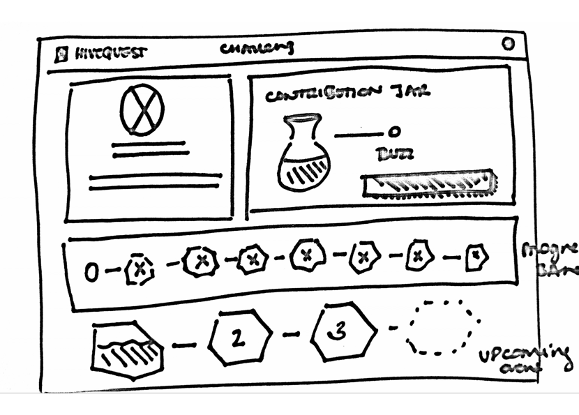
Through multiple iterations of sketches and layout design, we were able to narrow our ideas into two design layouts. We, user-tested both designs to see how users reacted and responded.
After A/B testing with users, a couple of main points stood out:
People were more drawn to the boxed layout, as it helped visually organize the page.
People felt that having too many features cluttered the page.
People felt that having a vertical progress bar was more motivating than having a horizontal progress bar.
People felt that having too many calls to actions confused them from achieving the main goal.
Feature Final Design
Interactive Prototype
The interactive prototype showcases the main new features that we've included in our design.
The notification bar is placed in the right-hand corner to inform users of the latest changes.
The progress bar is clickable and redirects the users back to the challenge they want to participate in.
The progress bar & contribution jar are placed in main pages to promote higher engagement.
The contribution jar is clickable, and explains the importance of giving back in a community.
Before & After
Re-Design of B2B Page
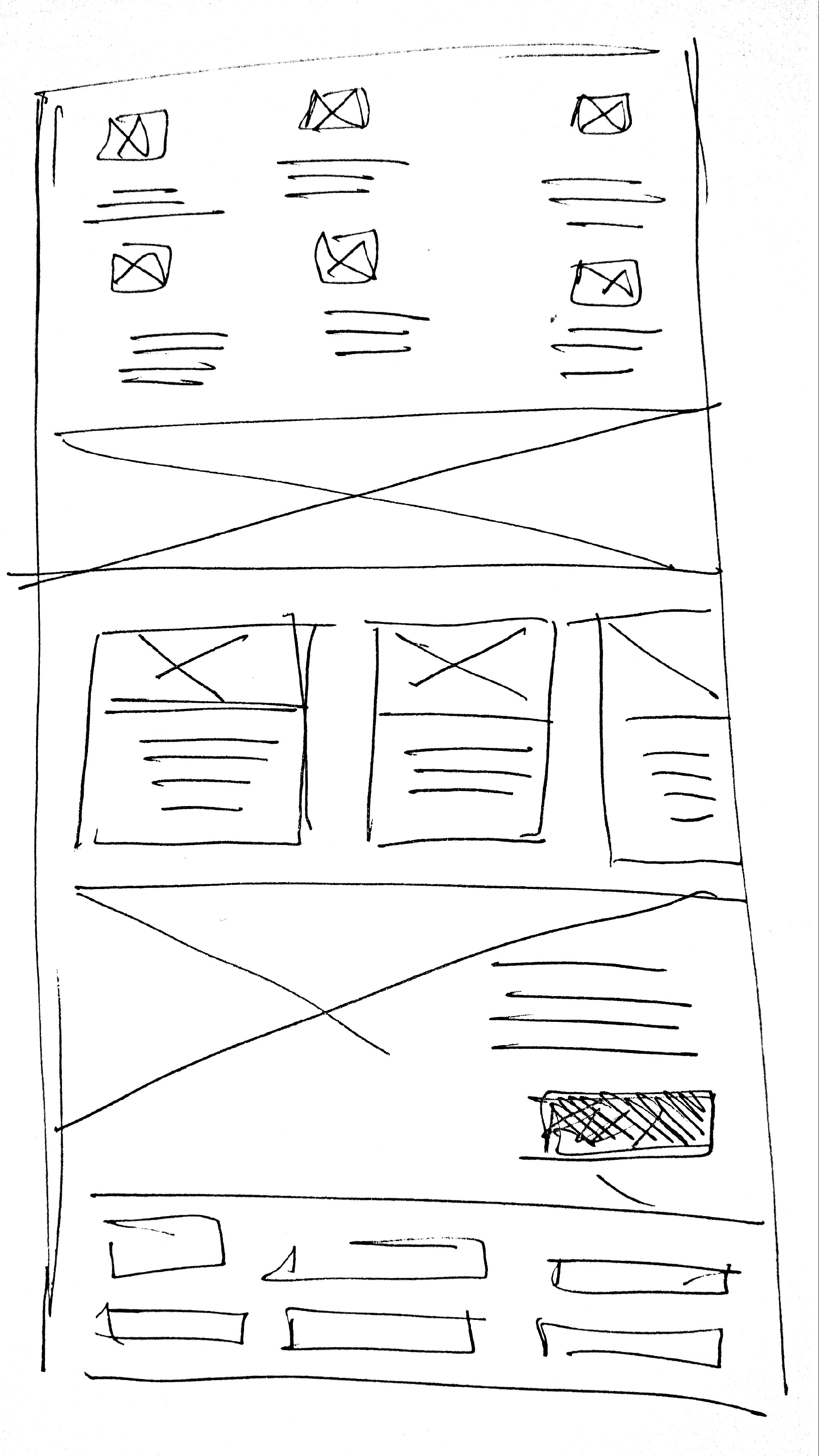
Hivequest wanted to create a page that engages and captures business into participating into their platforms. Below are the initial sketches that led to the creation of the final high-fidelity version.
1) The first thing the users see is how beneficial HiveQuest is to them and their business.
2) Videos are used to engage the users and teach them about the platform.
3) A strong testimonial that is visually drawing allows the users to connect with the success of the platform.
4) The signup opt-in is on the same page rather than directing the users to a new page.


