MACYS.COM
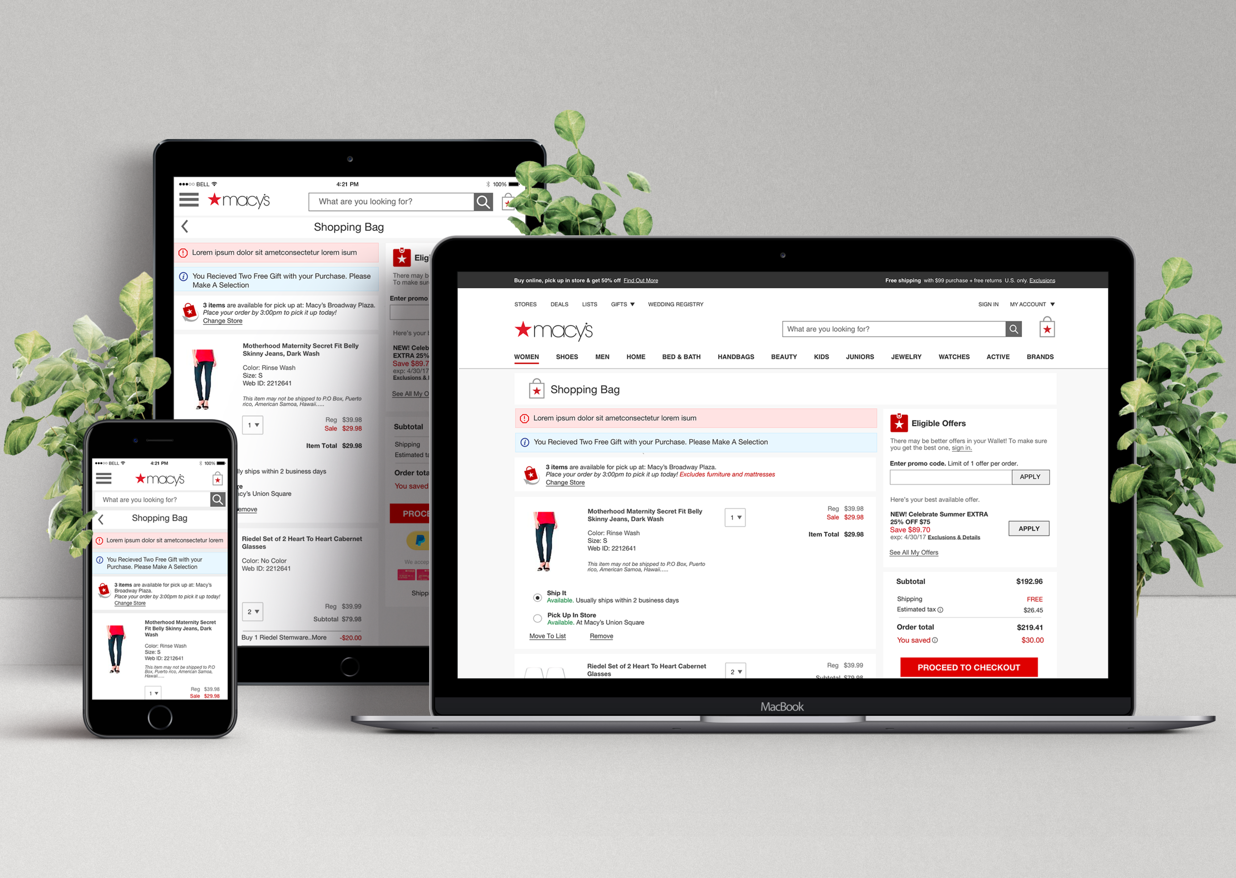
RESPONSIVE SHOPPING CART
At Macys.com, we balance our business goals with our consumer goals to inspire and provide a delightful experience. My role at Macys.com is to create a seamless purchase flow that instills confidence and increases conversion.
PROJECT SCOPE
The Shopping Cart page was outdated and had numerous points of friction that kept us below the industry conversion rate. I was assigned to explore these customer pain points, design new solutions, and iterate the whole experience while also transitioning to responsive.
- 2 UX/UI Designer: Zach Baker & Me
- 1 Product Manager
- 12 Developers
- 8 Months
- Lean -> Agile
OUR FRICTION POINTS
The shopping cart page is a crucial point in our customer's journey. It is where she reviews her orders, and makes her final decisions before heading to checkout.
Some of her major friction points are:
- The lack of clarity in promotions and final price.
- The difficulty in navigating back and forth in her purchase & checkout flow.
- The confusion in how to ship or pick up her item (See Project Here).
- The lack of understanding notifications and messaging, and what to do next.
- The confusion around receiving, selecting, and removing bonus items.
PROCESS
RESEARCH
Research, analyzing data and asking why customers behave the way they do helped us understand their major frictions points, and how to design for them. Usability testing, interviewing, eye-tracking, as well as live experimentations honed our solutions that inspired our final layout.
EYETRACKING
Heatmaps visualize the concentration of one's gaze over the experience, revealing the focus of visualization. They also help us to see how efficiently users complete their task.
Using the findings of eye tracking, as well as the other types research inspired us to change how:
- Pricing & promotion is laid out
- How users navigate to checkout, rather than scrolling to the bottom, the order summary is now sticky.
- Improved BOPS flow + module
- More noticeable & clear notification & messaging
- Improved flow of their Gifts & how to select them.
SKETCHING + WIREFRAMES
Through multiple rounds of sketching and iterations, we were able to create the final wireframes. Wireframes help socialize the changes to stakeholders & other teams to get ahead of any feature and financial impact.
RESPONSIVE
Going responsive gave us an opportunity to create consistency across all platforms. We started with a mobile-first approach, used a 12-grid system to design our layout, and focused on our content to ensure our experience is not compromised.
REDESIGN
1. Pricing details are now grouped to improve readability and calculations.
2. BOPS selections have it's own real estate, has more precise messaging, and is consistent across all viewports. See Project Details Here.
3. BOPS header is cleaner, consistent and provides better context.
4. GWP has its separate section to differentiate between free items and purchasable items.
4a. Concise messaging and notification across all viewports. Usage of color to provide a context of importance.
5. Promotion & Offers have a cleaner experience, more direct actions, proper messaging between item level & order summary.
6. Order summary has the relevant information, CTA is transparent about next steps and sticky to increase visibility.
THE DETAILS
DEMO
Working with an internal environment demo allows us to catch unexpected bugs, fix unresolved experiences and test if the content responds accordingly within every viewport. It also allows us to explore responsive components and if they are behaving as expected.


